Using search redirects to enhance user experience.
Note: I work for a company that offers a search API. However, to the best of my knowledge, none of the companies mentioned here are customers or in discussions to be customers. This is my personal point of view.
If you’re American and you’re looking to purchase things in bulk, you’re probably a member of either Costco or Sam’s Club. While most associate these with their warehouses full of products, both have a thriving e-commerce presence as well. Costco’s website, for example, got nearly 500 million visits in their most recent quarter.
One thing I noted recently when testing their search engines (as well as Target’s) is their use of redirects for head queries.
Head queries are those search terms that are searched in high volumes and tend to drive high revenue in turn. They tend to be pretty broad in intent, and because they have a large volume, they benefit the most from optimization. That’s what we see with all three retailers, though with some different approaches.
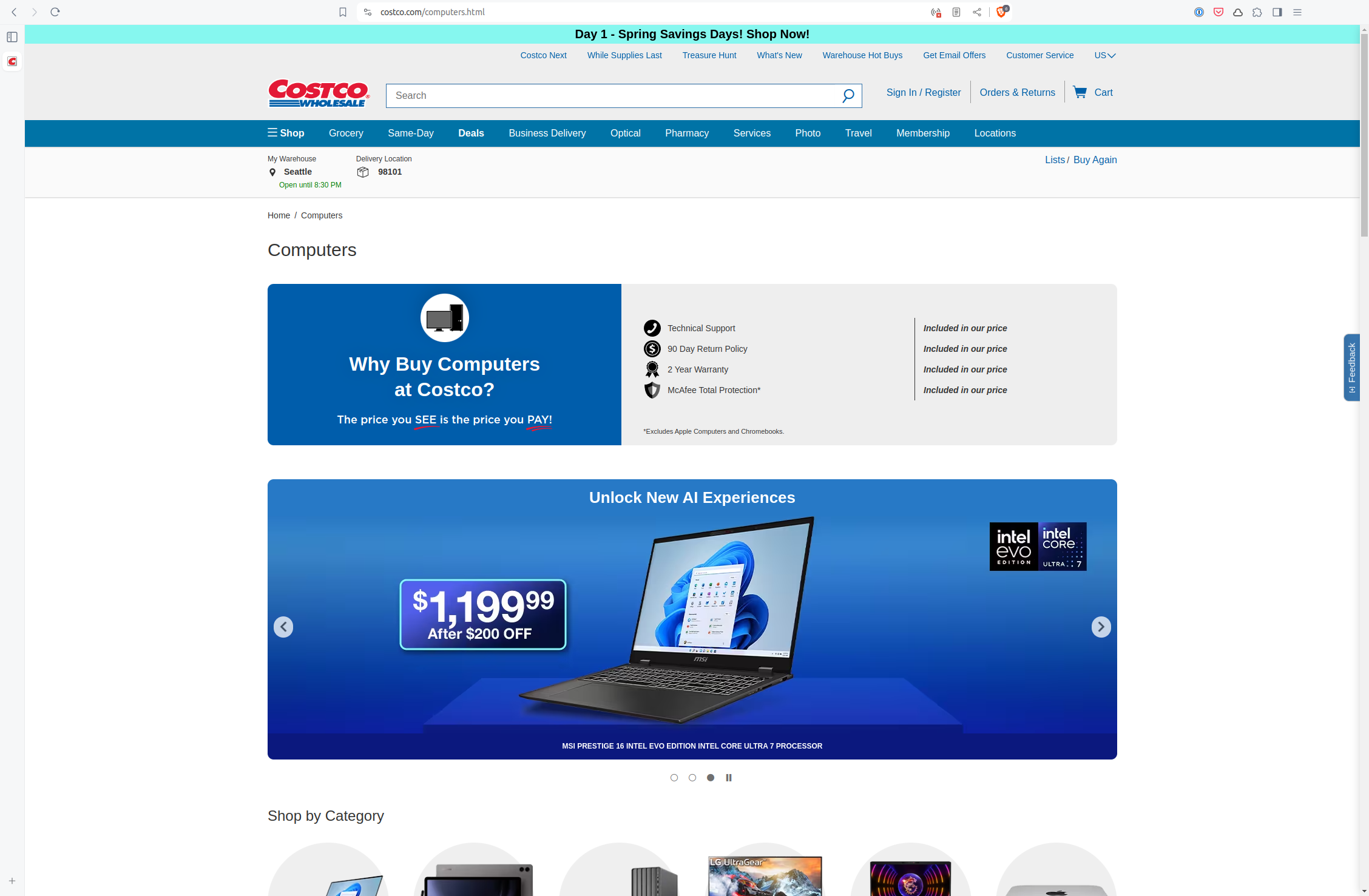
Take the query computer. (Note that head queries also tend to be short, often single words.) Costco redirects this query to a page that isn’t search results at all, but is instead an optimized category page:

This is smart, because search results need to be standardized. There are infinite combinations of search queries and search results, and so the results page has to be able to handle those. A curated category page doesn’t need to adhere to these constraints, and we see here that it doesn’t.
The top of the page is able to target with messaging about why a computer at Costco (good!), followed by a flashier carousel pushing what the merchandisers want customers to see. While search should serve up what’s most wanted by customers almost all of the time, there will be times where a human touch is needed. For example, with limited time sales or brand new products.
I don’t think, in this case, that this carousel is actually good for customers, though. It’s true that a human touch is sometimes needed. However, this takes up so much room and pushes valuable information below the fold, that it seems to serve the needs of the merchandisers and buyers than the customer.
Further down are ways to refine this search to be more precise. There are options for brands (with logos) or categories:

This is smart for a search term as broad as computers because a customer could get pretty overwhelmed by choice. This kind of layout instead helps to guide customers to what they actually had in mind. I think if they’re going to do this, one way to improve this section is to focus on the searcher goals rather that a straight categorization. The searcher who knows the relative benefits of a laptop versus a mini PC is the searcher who knows how to formulate a search to get the desired one. It’s the searcher who needs to check her email, or upload his photos, or any other specific goal other than “buy a computer” who would most benefit from this guidance.
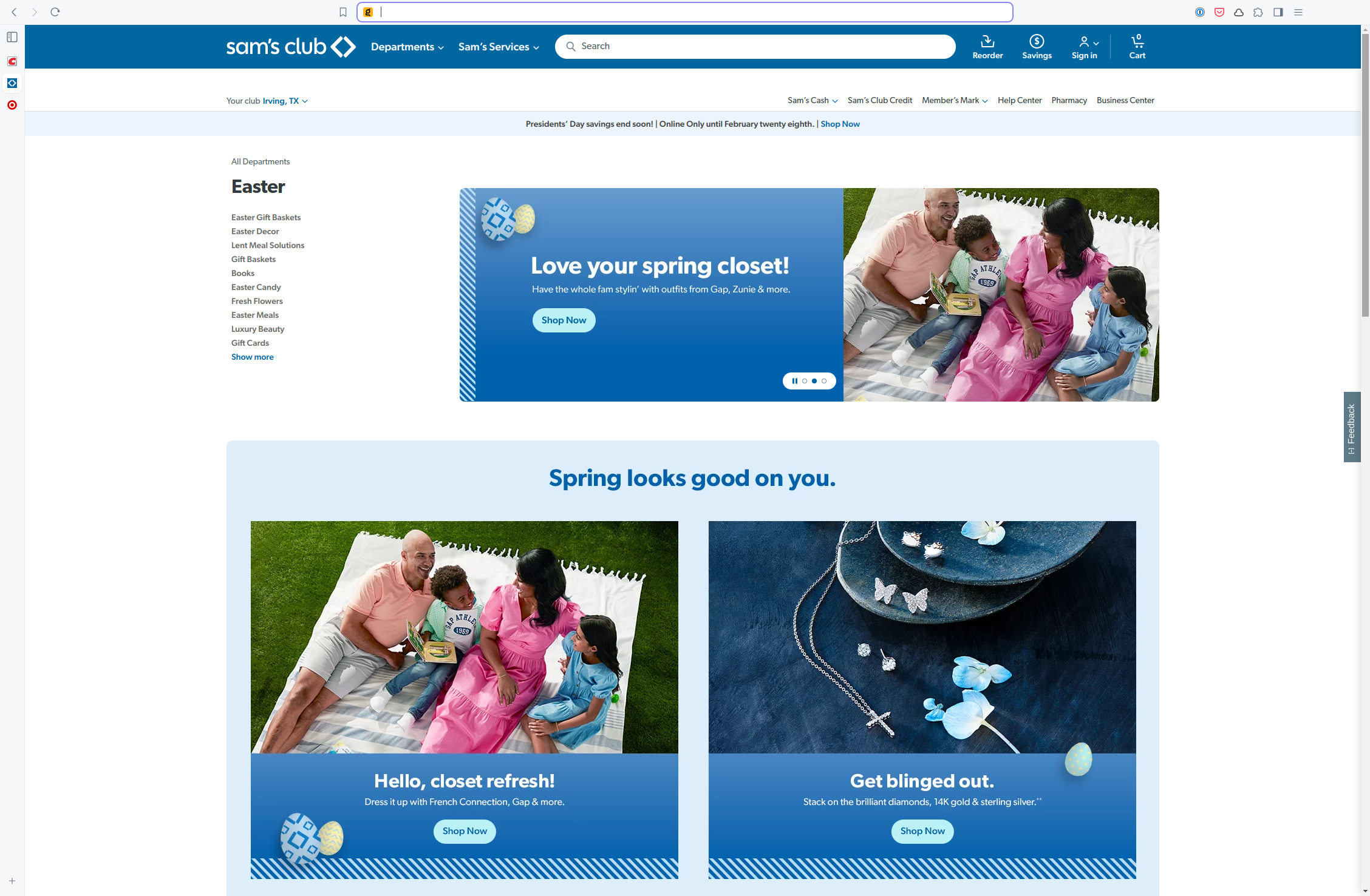
This kind of redirect doesn’t always work to the searcher’s benefit. Look at Sam’s Club’s landing page when you search for easter:

Now, it’s hard to know exactly what each user is trying to find with a given query (which is one of the reasons why offline search quality analysis is so difficult), but I don’t think a clothing refresh or jewelry is the primary intent. This is implicated by the subcategories to the left, none of which name clothes or jewelry.
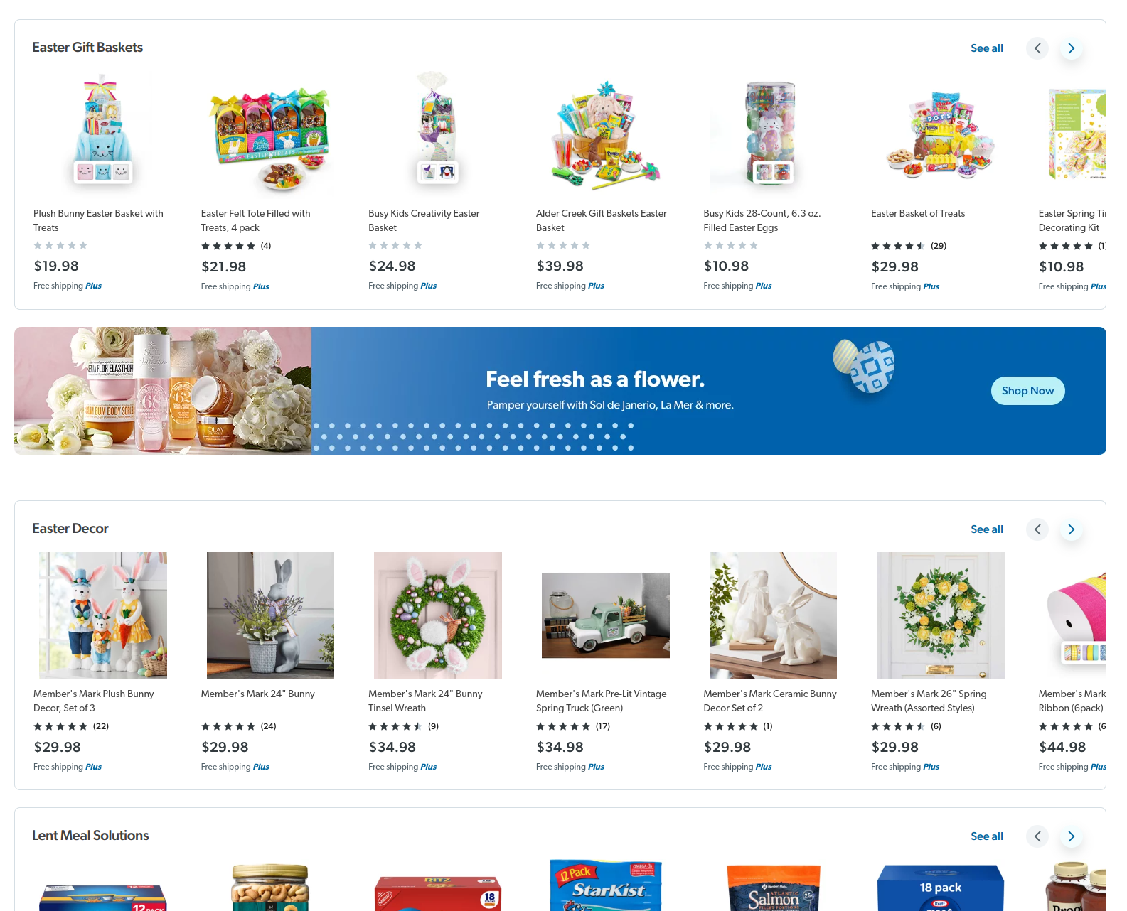
What makes this landing page worse is that the carousel at the top has two of its three panels duplicated right below. And it pushes all of the useful sections below the fold:

Even more egregious is that Sam’s Club also redirects to this page for much more targeted searches, like hard shell easter candy! If you’re going to take this approach (or any search approach, really), it has to be with an eye of serving more of what searchers want. Unless your goal isn’t to sell more products, of course.
A Hybrid Approach
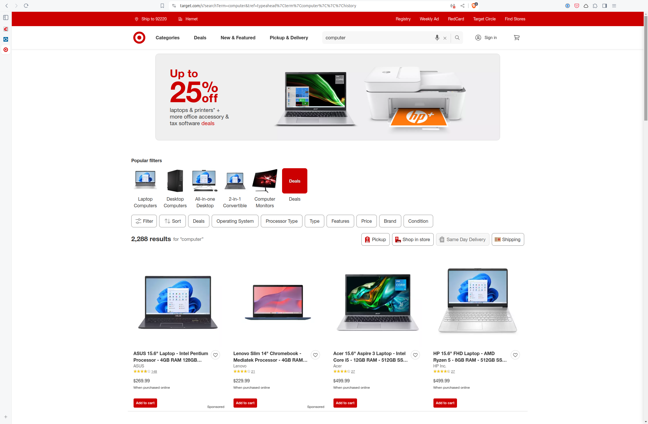
Redirecting to a category page is one way to “break free” of the constraints of a search results page, but it’s not the only way. A hybrid layout using banners or other inserted content can also work, such as Target’s computer search results:

This may not be the most useful offering ever, but some searchers might find it interesting, and it doesn’t push everything interesting below the fold.
By the way, I really like those visual popular filters. They seem like they can be really useful for broad search terms where filtering is a common action.
As you can see, for broad, common queries, redirecting to an optimized landing page can prove useful. These allow you to break out of the constraints of search results pages. (Although a hybrid approach with a banner can also work.) However, it needs to be done with an eye towards improving the searcher experience, not taking advantage to push internal goals.